What are your main advantages with neutral colors?
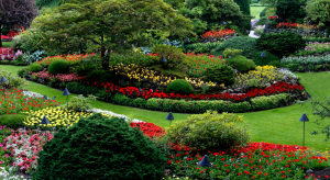
It is easy to list the positives of Neutral paint colors. Lighter and softer versions are perfect for optimizing space because they better reflect light and generate a feeling of spaciousness. Darker or more intense ones, on the other hand, add information without weighing down the look. Realize that sober tones are part of the nature. Therefore, options that resemble clay, sand and different types of soils also fall into this category. It is worth exploring the examples brought by natural materials and harnessing the power of neutral colors in decoration.
DISCRETION
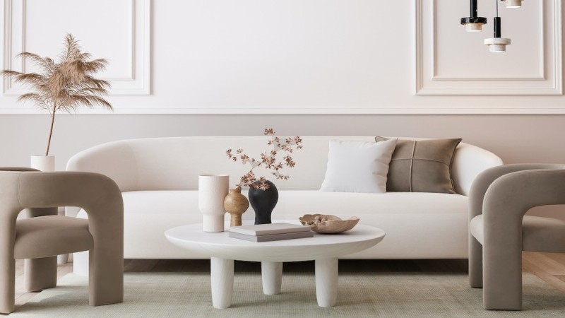
This is the standout feature of neutral shades. After all, they enhance the beauty of other colors and details present in the decoration. The sober tones act as frames that bring out the best of each environment. Neutral nuances can receive layers of shine or textures in more daring projects. Thus, those who do not want so much discretion should invest in options such as silver (grey), aged gold (beige) and rosé (burnt pink) when choosing paints, coatings and even materials with a metallic effect.
VERSATILITY
Another point in favor of neutral colors in decoration is the possibility of using them to compose projects with different languages and styles. The palette of tones will depend on the chosen theme and you can combine them with more striking nuances (such as neon or gloss versions), according to the taste of the residents.
- Scandinavian decor — brings many light surfaces to reflect and make the most of natural light.
- Classic decor — usually white and beige surfaces predominate, as well as furniture made with wood.
- Minimalist decor — there are also elements that vary between gray and brown.
- Industrial decoration — bets on tones that recall rustic materials, such as burnt cement (gray).
TIMELESSNESS
Everything that is discreet tends to become timeless more easily. After all, it does not change over time, nor does it depend on trends that, from time to time, change the way we see things. In this sense, neutral colors win over vibrant tones because they hardly lose their place in decor. While versions like ultraviolet gain momentary prominence, options like beige and gray remain among the choices of different professionals, no matter the season. Thus, for those who want to convey the impression that the environments are always looking up-to-date, it is worth investing in sober palettes.
SIMPLICITY
If we consider that the use of neutral colors in the decoration makes spaces discreet, timeless and versatile, we will combine colors without much sacrifice. Soft palettes blend and work perfectly alongside bolder nuances like red, blue, green or orange. This means that color matching becomes simpler, no matter what style or theme you want to work with in your home. The good news is that with Foyr Neo interior design software, now you can create the perfect interior for your house.
Many places to search for ideas and solutions keep home spaces in balance. In the midst of blogs and social networks focused on images, it is possible to find incredible examples.